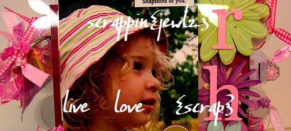


Yeah, it was inspired by the layout I just made - I loved the way the rubons looked! The purple paper is from the DCWV Rustic Stack {one of my FAVORITE stacks! I have already had to go back and get a second one!} and is pre-glittered. I took the cover off the journal and put the paper on, then put the journal back together before adding everything else. The holes were a pain - my square hole punch was too short to reach before the paper was glued down {and covering the holes from both sides} and just enough not the right shape to make punching the holes a pain. Got it done eventually though. I added the chandelier because we get extra points for them on the team challenge, and was bummed that it came out crooked {I tried to move it, but it was already stuck down in places and would NOT have come off nicely for repositioning, so I just left it where it was}. The flourish rubons are from Basic Grey {yeah, have I mentioned how much I'm into flourishes lately?} The swirl gems are from Prima, and partial pieces {I tend to cut up the big swirls.. they seem too extravagent to use all at once!} "Thoughts" is Making Memories rubons, my favorite font {which, of course, I can't find locally anymore.} The flower is another of the Imaginesce flowers with another silver button in the center.
Then there is the butterfly. Which SO did not turn out how I imagined it. How come things never turn out the way they look in your head?!
The butterfly is grungeboard, and I tried to ink it a la Tim, using his cute little tools and distress inks. I wanted it purple and don't have a purple ink pad, so I thought ok, if I bled blue and red, that will give me purple.
Yeah.
Not.
Colored it over a couple of times before I got something passable as almost purple, and thought - oh, I have Purple Perfect Pearls {say that 5 times fast!}, I can use that, make it glittery AND purple, and it'll look great.
Again.
Not.
Actually it probably would have looked ok at that point, but I got the bright idea of stamping over it with the french script stamp - which I could use the gold perfect pearls on to highlight it - it's a look I really like. Only... yeah, when Tim says to heat fix the ink before applying new stuff... yeah, definitely recommend that. {Rolling my eyes here} What I got was a gold butterfly sans words. ugh.
So I wiped that all off and it turned into a dullish browish purplish goldish thing. I thought about pitching it, but I have problems with that {especially when it is a precious piece of grungeboard!}, so I thought I'd use a glitter pen to outline the edges and do the body. The first choice was purple. Ick. stamped that off onto my paper mat, and went for silver. That worked a little better. Only I still wanted some shimmer to it, so I tried to glimmer mist it a little.
{Word of advice... Do the glimmer misting BEFORE outlining with a silver glitter pen. Works much better that way!}
Let it dry {somewhat} and added it on. I do actually like it - it is sorta purple, and shimmery {as are my fingers.. and my table.. and my desk...}, not that you can really tell that from the photo.
But colorwise, I think it really goes well with the paper... too bad it wouldn't look that way if I tried to do it on purpose!!! LOL


1 comment:
LOL! So this one was hard earned, huh? Turned out beautifully!!!!
Post a Comment