Tuesday, November 24, 2009

My goodness, it has been a long time...

Sorry it has been so long since I blogged. We have had company here the last several weeks (my brother and his family are staying here while they are looking for a house to rent.) and it has really been wearing me out. But that's another story.


(from Tim's blog, link below)

Had a couple of pieces of good news today - the first being that Tim is going to do the 12 Tags of Christmas again this year. He wasn't sure he would, after what happened at the stamp show, so I was really glad to see the announcement today. Check it out HERE on his blog - there are going to be lots of giveaways each day. I was lucky enough to win a stamp set last year!


(from the Wolf website, link below)

The second - Jason will be doing the Acoustic Christmas Concert  in Kansas City, MO on December 9th - and Rhi and I will be going! Along with Jason, we will be able to see Jimmy Wayne, Chris Young and Love and Theft!! They will all be onstage at the same time, which will just be so exciting. And they will be helping the Salvation Army with toy donations too - One of the things I love the most about Jason is how much he wants to help others.

The third  -  the guys finished installing the new wood furnace today - woohoo! That means we will have better heat this year. Course, that also means we'll have to chop a lot of wood o_O but at least the house will be warmer this year!

Monday, November 9, 2009

Photo shoot at the Riverview Park

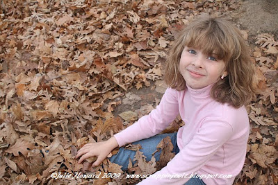
Today, I took my daughter to the park for some fall photos. {Wanted to take my son too, but he wasn't interested in going. So he stayed home} I wasn't sure the pictures would turn out, because it was overcast and the light was pretty dim, but I messed around with the settings on the camera, and I think they actually turned out pretty well. {Especially considering the camera wanted to use the flash when set in automatic, and I didn't want to LOL}

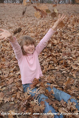
The first thing she noticed about the park was all the leaves. Which made her very happy. I made her stand by a tree until I figured out the camera settings, then let her play around. She had a lot of fun kicking up the leaves, loving the way they crunched beneath her feet.


I really like this shot. She was just sitting in the leaves and tossing them up in the air. But I really like how most of the background is leaves.


This is one of the overlooks for the River. It was really pretty, a little misty in the background. I love that little stone wall. There is not much land on the other side of it before it drops away.

Closer up/cropped view


Sitting on the wall and doing the model pose.


She walked over to the end of the wall and was looking off through the trees at the River. I really like this picture. In fact, it is one of my favorites from today.

Sitting at the picnic table.


"Let's pretend we are having a picnic!"


This is another favorite, even though it is blurry. Or maybe especially because it is blurry. I love how it shows the motion. She was having fun whirling around and kicking at the leaves.


Sitting in the leaves again {I was sitting on the picnic table}


Yep, really like this one. She was having so much fun.

Walking back down the path - she kept getting too far ahead for the camera, and I had to keep calling her back. The lighting in this photo is a little more true to how the lighting was


We found these beautiful yellow maples at the park.


Walking back across the grass to the car :which can just barely be seen in the background}


Found this statue of Mark Twain by another overlook in the park.


Looking out over the river.


All in all, was a fun afternoon. I'm really pleased with the photos I took, especially considering how dim it was. And she had fun too, which always makes it worth it.

Chasin' Jason Layout, or What I Did This Weekend...

Had an idea for a layout.. wanted to scrap the "I can sleep when I'm dead weekend".. using maps as part of the background of the page.. I wanted to  outline the route we took that weekend, and have a few pictures from everything we did. So I picked up an atlas to have maps from IL, MO, and IA.

Funny thing about atlases.... the maps are all different sizes.  So if you want to try this at home, I'd recommend getting a rolled up wall map or something instead. I ended up taking a page out of another atlas that was bigger, so MO was actually fairly close in size with IA and IL. {hopefully, we won't be needing that page from the atlas anytime soon.....}

Spent about an hour cutting out and piecing the map together. Didn't really want to leave out St. Louis... or Bowling Green.. so the LO evolved to include all the JMC concerts I've been to. There have only been 5, and they were all within 300 miles of home.. so.. how hard can it be....?

Well, incidentally.. THIS particular map was too tall to contain the layout on one 12x12 page. And not wide enough to make sense on a normal {HA!} 2 page layout. So.... what to do...

As they say in scrapbook organization - Go Vertical! Yeah! That will work! I think....

The only other problem I ran into, was not planning ahead and making smaller {2x3} photos. That would have been nice... Ah well.  I am still hoping to do the weekend layout {since it involved more than just JMC}.. sooooo... So much for my route outlines... Ah well, at least the important information is on there.. The other thing I wish I had done {hindsight being 20/20...} is set the map a little higher on the page, since three of the shows were to the south.. and two of those shows are the ones from which I have the most photos...

And, needless to say.. my desk isn't really set up for a 24x12 layout... so that made matching things up a little interesting. But I managed.

What I ended up with is a tri-fold vertical layout. It actually involved making four 6x12 layouts, and one 12x12 layout. Eventually I will have to figure out how to put page protectos around it.. but I figured since I don't put my layouts in albums anyway {insert rolling eyes smiley here}, I'd worry about that later.

I didn't want to leave much room for journaling on the inside, so I put all the journling on the outside of the layout.

Here is the front of the layout (unopened).


The background paper is from the DCWV Rockstar stack {which I use on all my JMC layouts}. The very cool title letters are from Creative Imaginations. I love them, and wish I had more of them. But luckily, I found enough letters in 1 package for the title I wanted. {And NO, Chasin should not have a G on the end, that would ruin the rhyme! I do wish the set came with an apostrophe though!} I inked the edges and added some mini gems. The stars were punched from the hot pink lips paper - they were attached over the stars on the background paper. Also added gems and glittery stuff to the background pattern. One of the reasons I chose this paper and these letters.. they go Oh so well with Jason's shirts.

The journaling, for once, I actually wrote ahead of time in my notebook -  usually I just wing it, but I wanted to highlight words with the MM tiny alphas, and knew I had limited space. The journaling I wrote didn't fit, so it was modified a bit, but it is pretty close. Got all the important info I wanted to put in there. Stamped the flourishes and inked the paper edges before doing the journaling, then started working on it. Took me forever, since I had to ink the edges of all the tiny alphas. But I really like the way it turned out, so it was worth it.

Closeups of the front pages:
{and yep, I know I have to add an L to Carroll... I ran out!}


{If you click on the photos, you will get a bigger one, which means you can actually read the journaling, if you want to!}

Incidentally, I actually did these pages last.. part of the reason was to cover up the brad prongs from the photo side of the layout. I also added some paper hinges to keep the pages together until I figure out how to handle the page protectors.

Here is what the inside looks like:


 This time, the stars were punched from the hot pink heart paper, and the hearts from the lips paper. Each star marks a concert, except for one, which marks home. The tags attached to the stars indicate the {one-way} mileage to that concert. The flowers are from Prima. I used the tiny letters for the place and date, as well as for Tim, Richie, and Shaun. This layout includes some of my favorite photos, though not all of them {the whole resizing issue again} And as much time as I spent on the stupid map, it's hardly visible, but really, I'm ok with that. The important parts are still showing, and I think it still gives a good idea of distance.

Here are the closeups of the inner pages:


I am pretty pleased with this layout.. I like how it came together, and I really like that it has all the concerts on it. I'll be really pleased once I figure out how to put the page protectors on it so the layout can be opened and still be protected. I'm sure that tape will be involved.

Oh, and this is what my daughter came up with today.


She wanted me to take a picture with my phone to send it to Jason. I laughed and said we'd better use the regular camera, since I don't have Jason's phone number. Then we posted it on Twitter.

Here's Jason's reply:
JMCOfficial “Hey Jason, this is from my daughter! :D @JMCOfficial http://bit.ly/3Wb4AS -@jmcarrollfan <-- Awesome! I'll try darlin!

Yeah, she was about as thrilled as I was :D
Wednesday, November 4, 2009

Serendipity POTD, and @JMCOfficial

Kristin picked my Pumpkin Eater layout for the POTD for 11/3/09 on the Serendipity Scrapbooks board. 
I love this layout {and sorry for the bad photo - it's washed out from bad lighting and camera flash}
I really love the picture on this layout - we were having so much fun when I took it {and no, he didn't really eat any of them... but successfully grossed out his sister because she thought he was going to!}


Papers are from Pink Paislee and Little Yellow Bicycle {I still think that is a cool company name!} Alphas are also from Pink Paislee, and are actually a nice shade of glittery green. I used the MS Drippy Goo punch for the green drips - I love that punch! The journal box is also Pink Paislee, and the alpha stickers are Making Memories.


The black velvet flowers are from Maya Road - I wish I had more of them.. I will be sad when they are gone.  Black pearls are courtesy of Jack Sparrow.. oops! I mean Prima! The purple pearls are from Queen & Co. I don't remember who the purple gems are from - tossed the package already, and I forgot to write it down {oops}.


The pumpkin is a wooden piece that came in the Halloween kit. I painted it with Tim's spiced marmalade crackle paint {which I dried with the heat tool since I was too impatient to let it dry on its own}. I inked over it with Tim's Black Soot ink, then wiped off the excess. The stem was inked with pine needles ink. The design was cut from one of the patterned papers, and I added little red gems {Basic Grey} for the eyes.

So, my other favorite thing to do lately is get on Twitter and chitchat with some of my HTFs. It's always interesting to see what some of the musicians I follow are doing as well. Jason posts quite often on Twitter, to let people know what he's doing, and will sometimes post photos. He took this photo tonight while onstage {he was performing with several others - Kellie Pickler, Phill Vasser, and Jimmy Wayne} in Scranton, PA.


{photo by Jason Michael Carroll}

And one of the HTFs, Teri { @TewiTso on Twitter } had gone to the show and took this picture at the same time Jason took the above picture!


{Photo by Teri Dimmett}

I'm tellin' ya, the man cracks me up.
{and Hell yeah, there will be a scrapbook page for the album!}

Oh, yeah, and check out his awesome Halloween costume:


{photo originally posted on Twitter by Jason Michael Carroll}

Pretty cool, huh? The family theme this year was super heroes and villains. {Robin is his son, JW}
Oh, and ironically, guess what was on TV when I took my dinner break tonight.
Yep.
Batman.